
A guided interface for editing renewable asset data without writing SQL
MEW2 sits on top of our SQL Server databases so teams across Avangrid can maintain sites, devices and certificates through forms and a browsable tree instead of raw queries.
- Role
- Designer & developer (solo)
- Timeline
- June – August 2026
- Collaborators
- My manager
- Tools
- React, Chakra UI, ASP.NET, Entity Framework, SQL Server
- Outcome
- Launched to our team. It replaces direct SQL edits with a guided interface and is rolling out to more teams.
Overview
I was asked to build a website that works as an interface to our SQL Server, so people could change the database without touching SQL. The goal was to let several teams across the company maintain and update our renewable inventory and its data themselves.
I was both the designer and the developer. I built an ASP.NET back-end that uses Entity Framework to make changes without raw SQL, and a React front-end with four main areas:
- Farms: our renewable sites and all of their devices.
- Certificates: the certificates tied to each site.
- History: what was created or modified, by whom and when.
- Asset management: forms for creating new devices of each type directly in the database.
MEW2, from scratch
Ingredients
- 1 cup competitive analysis (Dribbble & Contra)
- 2 tbsp manager feedback, every iteration
- 1 ASP.NET back-end
- A splash of Entity Framework
- React & Chakra UI, to taste
- 2 Miller columns, no more
Method
- Study. Compare dashboards that hold lots of nested data.
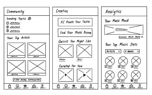
- Sketch. A sidebar of sites that opens into their devices.
- Build. Edits that wait in a pending-changes panel until you commit.
- Review. Walk each build through with my manager, then iterate.
The problem
What's the best way to display and surface this information?
Every designer wrestles with how an interface should look, but here the bigger question was how to surface a lot of information so it makes sense to a first-time user. That mattered most on the Farms page, which holds sites, turbines, pads and many other devices.
Research
Competitive analysis
MEW2 is an asset management dashboard, so I started by studying similar dashboards on Dribbble and Contra. I looked at how they organize large amounts of information and how people move between a high-level overview and specific details.
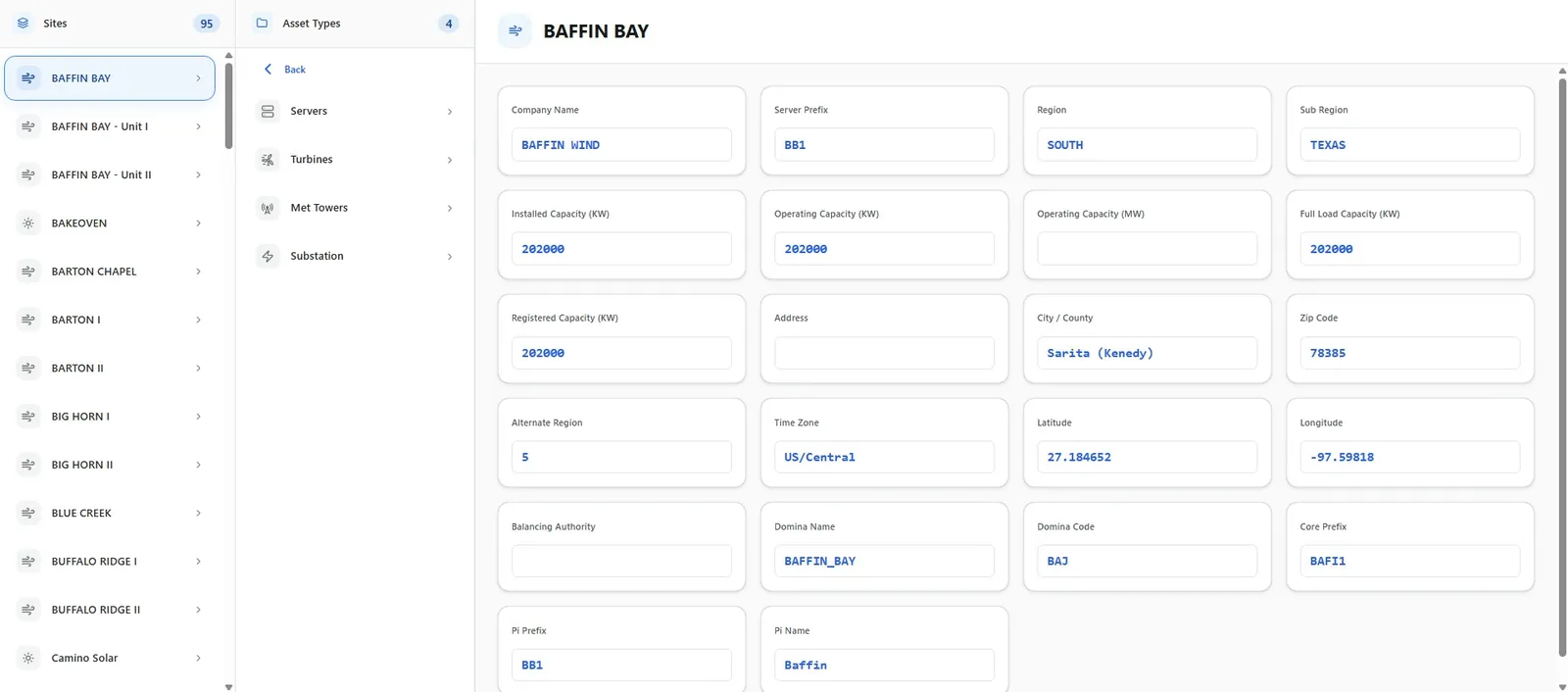
One pattern kept coming up: a persistent sidebar for hierarchical navigation. I adapted it so the sidebar lists each site, and clicking a site opens its child items. People can start at the top level and narrow down to exactly what they need without leaving the page or losing context.
Feedback loop
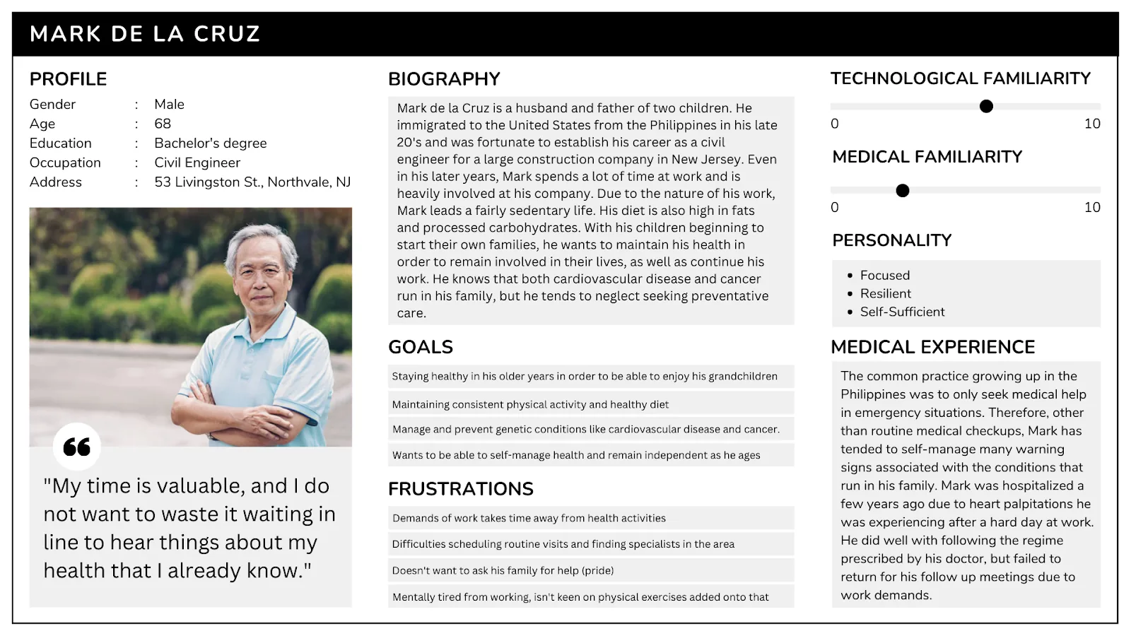
MEW2 was a brand-new tool, so there were no existing users to interview. Instead I reviewed each iteration with my manager, who represented the teams that would use it, and folded his feedback into the next build.
Key features
Review before you commit
Edits collect in a pending-changes panel. A global indicator shows unsaved work on every tab, and people can review each change, then commit or undo it.
Miller column navigation
Like macOS Finder: sites in the first column, their children in a second, capped at two columns with a back button so the layout never sprawls.
Validated asset creation
One form that changes its fields by asset type, marks required fields, and says clearly whether the asset was created or what still needs fixing.
History timeline
Cards that show what was created or changed, by whom, and when.
Tabs instead of pages
A button group swaps content in place instead of reloading the site, so moving between views feels instant.
Light and dark mode
A toggle so people can match the interface to their environment and preference.
Engineering for the interface
I chose React for the front-end because it was the framework I knew best, which let me move faster on the interface while keeping the server in the .NET stack the team already used.
On the server, one thin API controller hands work to a service layer split into small files by job: creation, attribute updates, batch saves, search and the asset catalog. Because the database stores many assets as generic attribute records, I wrote mapping layers that translate between the field names people see and the columns underneath, and convert text input into the right data types before saving.
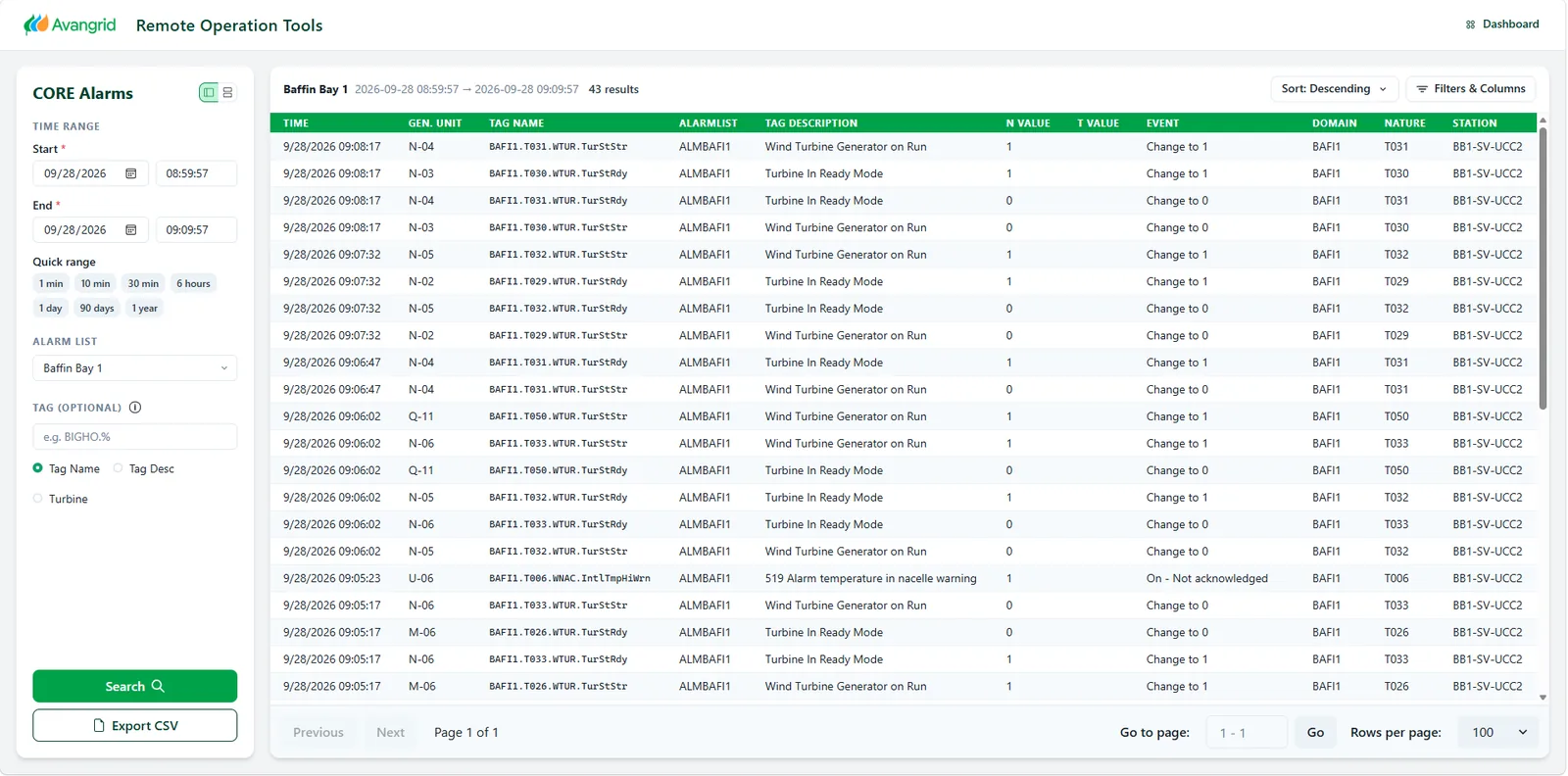
On the front-end, logic lives in custom hooks such as useAssetCatalog, useAttributeEditor and useGlobalSearch. Every server call goes through one API module with shared error handling, retries with backoff and request cancellation, so a slow connection never leaves the UI in a broken state. A global search bar highlights matching text so people can jump straight to an asset.
Small decisions like an input type can quietly damage data. I now think about validation and field types as a UX problem, not just a back-end one.
Lesson learned: a zip code field set as a number input was silently dropping leading zeros.
Screens
Takeaways
The tool was needed urgently, so there was no separate prototyping phase. I designed as I built, shipped working versions quickly and iterated on my manager's feedback. I'm proud of how well it surfaces information and explains things people can miss, like what a certificate is or whether a site is solar or wind.
- Entity FrameworkLearnedNew to me; the CORE Alarms build gave me a head start.
- Design while building1xNo time for a prototyping phase, so the build was the prototype.
- Feedback loopsWeeklyEach iteration reviewed with my manager.
Backordered
- SQL audit tablePendingHistory lives in the browser for now.
- Solar pad assetsPendingWaiting on the solar and wind teams.